Extra Lesson 1: Christmas Tree


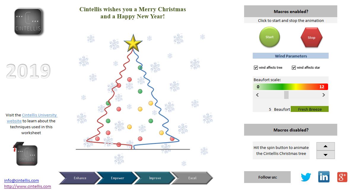
Today's lesson is a special one. While we were designing our Excel Christmas card, we thought it might be useful to share some tools and techniques there they could be interesting for your future dashboards. This is the card:


And this is on the menu:

  • The tree: Scatter and Radar charts;
  • The lights: Traffic lights conditional formatting;
  • The Beaufort scale: Conditional formatting with formulas / color scale;
  • The wind: Use of form controls within worksheets;
  • The background images: Using images;
  • The links to websites: Insert hyperlinks.


The download link is right here.

There's as well some VBA code embedded in the document - which won't be discussed here - but you might get a warning message when opening the workbook. The same rules for the external links. All features work without VBA by the way. Anyway, we hope you'll enjoy it.

If you prefer a version without macros, you can find it here.

Creating a nice dashboard is not a science, it's an art. The challenge lies in creating a visually appealing cockpit console while still providing all necessary information to the end user. To obtain good results, let yourself be inspired by what all web resources have to offer, try to master different approaches, never hesitate to ask, but above all practice, practice and practice again. One last thing, in case you'd miss him, don't worry, our tame imaginary skeptic we met in lesson 1 is still hanging around. As we learned, you'll recognize him in the blue parts of the dialogues.

I'm here already!

Great! How are you doing?

Pretty good, thanks. But I have one remark: I hope you won't go into too much details. I know you like that and I don't want you to bore our readers....

Don't worry. We'll just provide some basic info and remind to anyone who lands on this webpage that these tools exist. They can still contact us if they need further assistance. Enough time wasted, let's go!


The tree: Scatter and Radar charts

First things first. We need to draw a tree. And put a star on it.

These are images I suppose you just pasted in your worksheet?

Of course not. This is an Excel tutorial remember? Both are charts.

Charts?

Yes, charts. the tree is nothing more than a scatter chart. These are diagrams displaying data according two variables. You can see it as a collection of points, each having the value of one variable determining the position on the horizontal axis and the value of the other variable determining the position on the vertical axis.
Now, Excel has this wonderful "smooth line" built-in feature where consecutive data points are united through a smooth line so as to create the illusion of continuity. Ideal for creating our tree border. The only difficulty lies in finding the correct coordinates. As the tree is perfectly symmetric, only half of the work needs to be done though.

And how about the star?

The star is a radar chart. This is a graphical method of displaying multivariate data in the form of a two-dimensional chart. In this case, as our star has 5 points, we needed 10 variables.

10 variables for 5 points?

5 for the inner dots and 5 for the outer dots... Each inner dots sharing the same value. The same rules for the outer dots.


The lights: Traffic lights conditional formatting

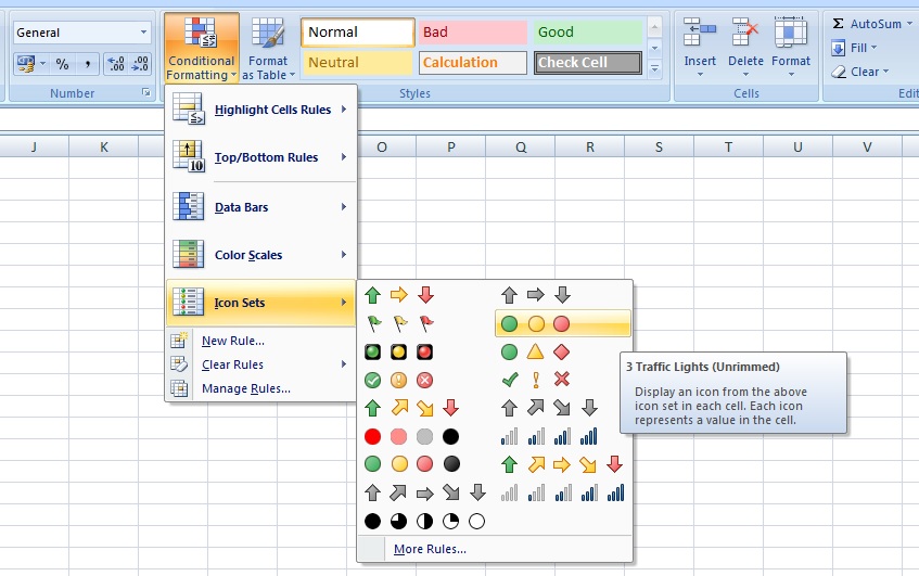
Most people think that conditional formatting only applies to the formatting of a cell - and in a certain way they're right - but few of them know that Excel can add icons to a cell instead of modifying its format. Icons can be arrows, quarters, rating charts and traffic lights.


They work exactly the same way and just tell something about the value of a cell according some rules you just set.

And why would I need that?

Well, if you need to apply a lot of conditional formatting in your dashboard, my experience is that changing cells background color can give a very bombastic feeling. And do you still see what you need to see when every cell is colored green, orange or red?

Maybe your dashboard is poorly designed...

Maybe. Or you didn't use the right tools. Using traffic lights at least gives some transparency to your figures. And they do quite well as Christmas lightning!

How do you manage to change the colors?

Assume 1 is associated to the color green, 2 to orange and 3 to red. For each cell, we use the RANDBETWEEN(1,3) function returning a random integer between 1 and 3. A new random number is generated each time the worksheet is calculated and creates the illusion of the lights changing color.

So, in each cell you need a light in, you use the RANDBETWEEN() function and apply conditional formatting. But how come you only see the traffic light and not both the light and the function's result, 1, 2 or 3?

That's because we set the cells text color to white!


The Beaufort scale: Conditional formatting with formulas / color scale

You love this formula conditional formatting feature or you hate it.

Well, I belong to the second group. I know it exists but it seems so complicated to apply.

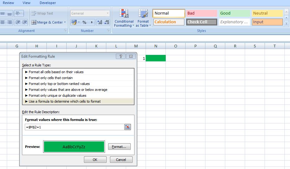
That's a shame, because there really are no secrets. Have a look at the image below:


We've set a conditional formatting on cell N2 so that it colors green when cell M2 has the value 1. In other words, if the formula you entered in the rule description is TRUE, than the conditional formatting will apply to the selected cell.

OK, got that. But when would I need such a functionality?

There are plenty of examples where this comes in handy. Suppose you create a ToDo list in Excel, one of your columns surely is the item's status. Now you automatically want to strikethrough the row when the status changes to "Done". The result looks like this:


And of course, should you ever create an Excel Christmas card you simply cannot not use this functionality. As you can see in our file, conditional formatting has been set to the merged cell "ZAA19" depending on values of cell "X19".

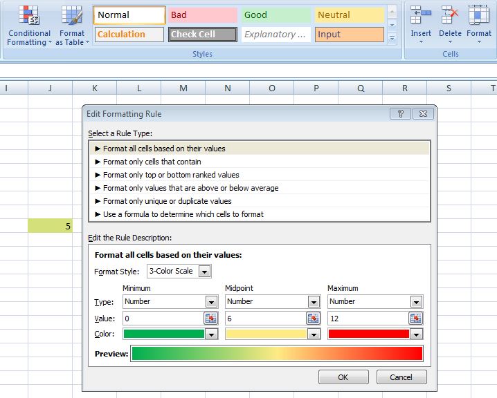
OBJECTION! There's a much easier way to achieve the same result by using color scale conditional formatting:


Good remark. The reason I did not use this here is because the colors returned by the color scale, although they can be modified, did not really match my expectations. So, my solution is certainly more time consuming but is a closer fit to what I really want.


The wind: Use of form controls within worksheets

We'll here only explain how one of the form controls work. The reasoning is identical for the other ones.

Excuse me, but form controls?

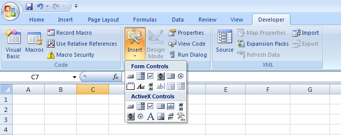
Form controls are all those fancy buttons, checkboxes, scroll bars etc. you can add to your worksheet. They can be found under the Developer tab:


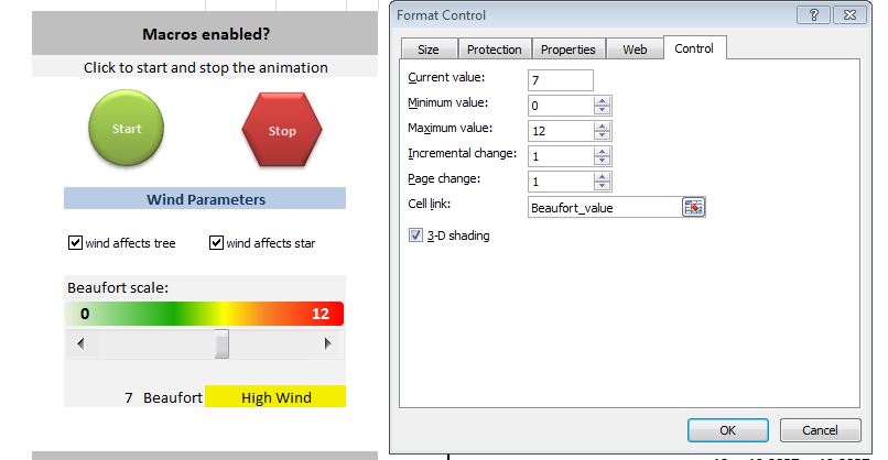
Let's have a closer look at the scroll bar used to determine the wind strength. The scroll bar can be placed in the worksheet by just selecting it in the developer menu and then clicking again in the worksheet. To switch between a horizontal or vertical scroll bar, you can just modify the heigth & width of the form. Once in place, you can right click it to access its properties. One of the submenus guides you to the Format Control where you can play with how the scroll bar needs to behave. As can be seen on the image below, for our Christmas tree, we've set the scroll bar min and max values to 0 and 12 respectively (being the min and max values of the Beaufort scale) and, very important, we've set the Cell Link value to a named range called "Beaufort_value", being the cell containing the actual wind strengh. This one will actually contain the actual scroll bar value, determined by the position of the scroll bar in the form itself.


a simple VLOOKUP() then matches the scale value to its description (the yellow colored cell).

And how does this influences the size of the star and the moving of the branches?

Very easily. The data of our Scatter Chart is linked to the value of this cell and a random factor. The greater the value, the more it influences the movement of the branches and the growing / shrinking of the star. Just have a look at the Scatter Chart data.


The background images: Using images.

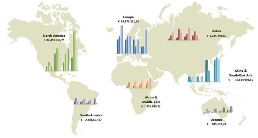
The white stars aren't charts, although it's not impossible to create them in Excel. But the added value would have been 0,0 so why do it? My preference always goes to using a transparent PNG file format. That way everything behind the image still can be seen - and appreciated. Just for your info, with a transparent PNG world map you can draw dashboards like these:


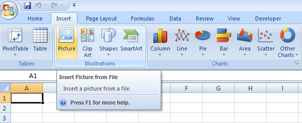
I almost forgot, this is the way to add external images to your worksheet:


The links to websites: Insert hyperlinks

I'll immediately interrupt you. Besides inserting a link to your company's website in order to generate extra traffic and promote yourself, why would you need that?

I appreciate your honesty.

You're welcome.

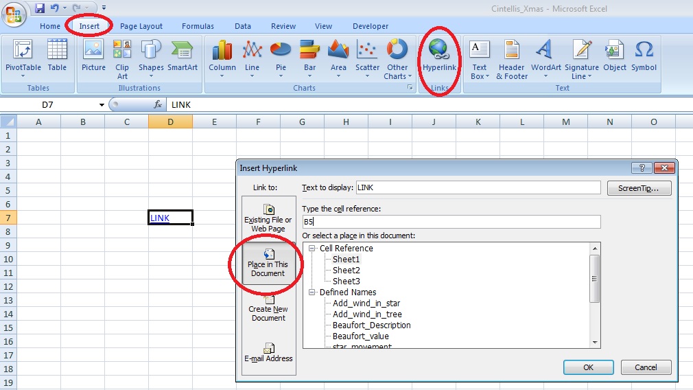
Well, maybe because a hyperlink does not need to be a link to an external website. You can for instance link a cell to another worksheet, or to a named range as shown below:


In this example, clicking on cell D7 will automatically route you to cell B5 of Sheet1. This might be useful when you want to enhance user's experience when browsing through your Excel application.

An important thing to know is that it is not possible to associate a hyperlink to part of cell. Suppose your cells contains the following text "Please click here to access our website", Excel does not allow you to set the hyperlink on "click here" only. However, you can create the illusion it is actually possible by just changing the font of that part of the string, as shown below:


We appreciate your feedback!


About Cintellis

Let us surprise you with how much more you can achieve by using Excel and VBA based products.

Are you looking for an on the level, reliable and trustworthy company that will surprise you with how much more you can achieve by using Excel and VBA based products? Learn more about our philosophy, products, services or contact us for more info.


About Numis

Flexible, cheap and very short implementation time, discover Numis, our Excel based Cash Management and Management Accounting Software and experience a totally new way to analyse and report on your cash positions.

At Numis, we help you to get more out of your financial data than you thought possible. From enhanced reporting functionalities and detailed analysis to providing enterprise budgeting and forecasting solutions, we will help you to achieve your business objectives. When using Numis, you can share your analysis and strategy with your business partners, suppliers or employees as needed.

Numis is a product from Cintellis bvba & FS&P bvba.

CONTACT Us

You can contact us by phone, mail or by filling out the form below.

Corporate address:
Alsembergsesteenweg 588
1653 Dworp
Belgium

Phone Numbers:
+32 (0)471 65 19 66

E-Mail: info@cintellis.com